Binder COver
While creating this project, I realized that I like making artistic collages to use as posters/covers/etc. This piece shows that I have challenged myself in my work because I knew I wasn't very good at blending colors, and I struggled slightly with arranging photo collages into a format that isn't cluttered or too spaced out. The most successful thing about this project is either the fading color background or how the images look inside of the picture frames, and I feel like the least successful thing about this is how it feels too cluttered from the middle to the bottom. By creating this, I learned how to better control the spray paint brushes in Adobe Photoshop Elements 7 and make colors fade from one to another in a smoother way.
Cincinnati Fireworks Meme
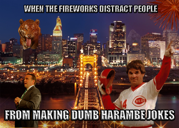
What inspired me to create the subject matter for this project was how sick and tired I was of hearing Harambe jokes and seeing so many memes about it. It was a terrible thing that happened, and to watch people play with the subject as if it was nothing angers me. I chose to use reddish-orange lighting because I don't have much practice with that shade of color, and I want to improve my skills with that hue. This project shows that I have challenged myself in my work because I don't normally shade/highlight objects with color, but I still used a reddish-orange paintbrush to add lighting. The most successful aspect of this project is how well the backgrounds of the objects were erased. The least successful is the lighting (shading and highlights). I learned how to better shade and highlight images in Adobe Photoshop Elements 7, even though I'm still not good at it.
Kaleidoscope

What inspired me to create the colors I used in this project was my favorite cool, calming tones such as purple, blue and green. I chose to use the word "MINE" for my text because my artwork will always be my artwork, an original piece that nobody else will ever own. I chose the background because it was very aesthetically pleasing and matched the color palette I chose for my triangle. This project shows that I have challenged myself in my work because I have never created a kaleidoscope or image such as that before where I had to plan to use very strict symmetry. The most successful aspect of my project was how the final product without text turned out (the sky and the buildings looked like they belonged together). The least successful aspect of my project is the text, which I tried but failed to give the appearance of a neon sign. I learned how to warp shapes in different ways than I had previously known.
Face Mask
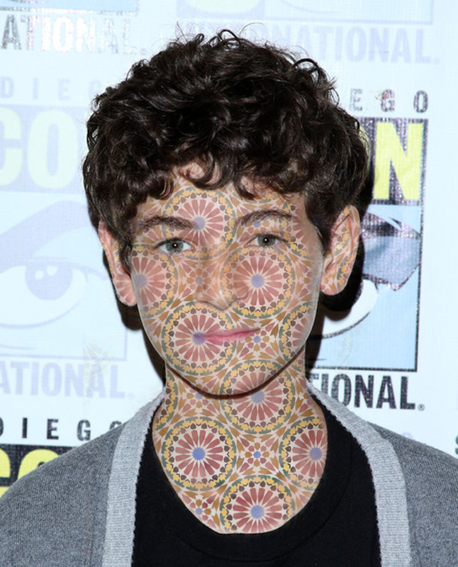
It was easy to erase the excess pattern (any area the pattern covered that wasn't on the visible skin) from the image. It was very difficult to edit the mask layer in a way so that you could still see and recognize certain facial features, but not turn the opacity of the pattern to a point so low where you don't even notice it. I learned how to properly use the mask layer in Adobe Photoshop, and I also learned that it is very difficult to create unnatural patterns on human skin.
color practice
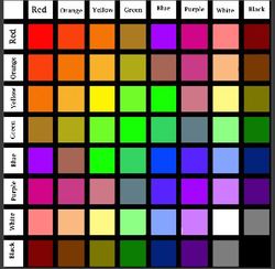
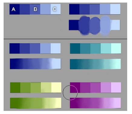
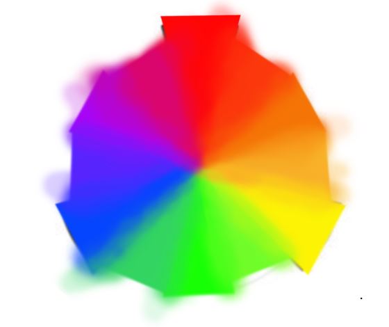
In this color project, I had many challenges and successes. Something that was easy for me was the value scales (middle picture) because I had digital experience making a gradual blends between two colors before. Most other parts of the project were very challenging for me; I struggled with creating the accurate colors for the color chart and blending the color wheel smoothly. I learned how to better blend and mix different colors in Adobe Photoshop Elements 7 from the large amount of practice this project offered, and I also learned what kind of colors secondary/secondary and secondary/primary colors make when fused.
Animal Morph
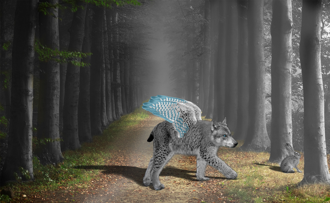
I find animal anatomy to be fascinating, so I like to choose very intricate or elegant animals in projects such as this. Wolves, falcons and wildcats are some of my favorite animals because they have these features, and that is why I chose to work with them. I found the background to be very mysterious with the fog and light shining brightly from one side, working perfectly with the feeling the animal morph gave me. My project is mysterious and thought-provoking to me, while still holding an element of beauty. This project shows that I have challenged myself n my work because unlike in the face mask project, I had to learn how to use the masking layer in Photoshop Elements instead of Photoshop. The most successful aspect of my project is how it portrays the emotions I had meant for it to show, such as curiosity and mysterious. The least successful aspect of my project is how the falcon wings looked after coloring them blue. I thought that it would give it a fresh, clean look but it just seemed awkward and out of place. I learned that if you transfer a Photoshop Elements document to a Photoshop program, add a mask layer to it and then transfer it back to a Photoshop Elements program, the mask layer will continue to work and be editable. I also learned that you can create very deep, philosophical messages in artwork subconsciously. For example, I hadn't even thought of how viewers would possibly interpret the wolf-wildcat-falcon fusion hunting the rabbit as the world hunting after us until after I had completely finished the project.
During first quarter of Digital Imaging, I learned how to use mask layers in Photoshop and blend colors in a much smoother way than I had known before. I think that my class participation was excellent, as I worked hard during the entire class period every day and also outside of school at home. So far I have enjoyed class greatly because the projects are challenging but not impossible, I am learning new material despite already having taken two graphic arts classes, and the teacher is very friendly and helpful. Even though I love taking Digital Imaging as a class, I am not fond of some of my peers who are overly talkative and disrupt my learning on a daily basis.
During the remainder of class, I would like to learn how to draw/illustrate in Adobe Photoshop Elements 7. I would like to learn this because I would be highly interested in pursuing concept art as a career, which is majorly done digitally now. I have traditional drawing skills, and I want to find a way to use those skills on a computer or tablet.
During the remainder of class, I would like to learn how to draw/illustrate in Adobe Photoshop Elements 7. I would like to learn this because I would be highly interested in pursuing concept art as a career, which is majorly done digitally now. I have traditional drawing skills, and I want to find a way to use those skills on a computer or tablet.
Charley Harper Inspired
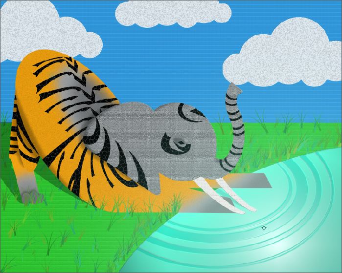
I was inspired by two of the most beautiful creatures in nature (in my opinion), the tiger and the elephant. The elephant represents intelligence and grace, and the tiger represents strength and courage. I was also inspired by bright, happy colors for the background and by different recycled paper textures for my layer styles/filters. This project shows that I have challenged myself in my work because I do not often work with adding filters to my art, and I rarely get the chance to "create" artwork instead of editing it. In past projects in this class we have edited photos mainly, for example in the animal morph, instead of creating something from scratch. The most successful aspect of my project is the tiger stripes in my opinion because they are a very challenging pattern to create from scratch, and I think I did a decent job. The least successful aspect of my project is the lighting and shading, to me it looks very sloppy and awkward even though I tried my best. I learned that art has many extremely diverse forms, and it's sort of like a gigantic tree; the trunk of it is art, then the branches are abstract, realistic, cartooning, the leaves are different artist styles and so on. The Charley Harper art style goes in this order: Art, Abstract, Charley Harper (in the way I visualize it).
SIGNATURE

The signature that I like best out of these variations is the third one down with a lot of variation in the line width. While working in Adobe illustrator, I learned how to add different widths to lines, how to alter lines into different styles without having to completely rewrite it and how to change vectors. Overall, I like my final assignment for the most part, but I am not too fond of the light purple and orange signatures.
EMOJI
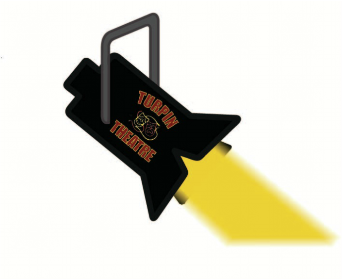
I was inspired the style of the Turpin Theatre logo and common emoji designs (thick lines and very simple). I chose to give a glowing/fading effect to the beam of light so that it would look more realistic. I used the width adjustment tool, the pen tool, the add anchor tool, the remove anchor tool, the paint bucket tool, the eyedropper tool, the paintbrush tool, the blur tool, the shape tool and the magic wand tool. I chose to use these tools because they were tools I have been best taught to use over the last three years I have taken digital imaging classes, and they also were the best choices for making very simple shapes/lines and for adding line width. This project shows that I have challenged myself in my work because a vast majority of the time I make very intricate artwork, such as in the animal morph project where I had to have a keep eye for detail. To create something that is purposefully supposed to be simple is difficult for me sometimes because it is a second nature to add a lot of details in my work. The most successful aspect of my project is how the design, when in full view, is very easily recognizable as a spotlight. The least successful aspect of my project is how it is hard to see what the image is when reduced to the size of a dime. I learned that Adobe Illustrator is a much better program for drawing with a tablet than Adobe Photoshop Elements, which I have been using for my digital drawing for the last two years.
fIRST SEMESTER REFLECTION
My least successful piece of work throughout the semester was the animal morph project. From this project I learned that you have to be extremely careful with what colors you use, because the slightest mistake could ruin everything. The colors I used in the piece were natural and very earthy, except for the pop of bright blue I used to color the eyes and wings of the wolf-wildcat-hawk hybrid. After I had finished and turned in the project, I immediately regretted using the bright blue. While I thought it would add a good focal point to the artwork and be a nice pop of color, it just seemed out of place and made me dislike the piece I had created because of my one small coloring mistake. I was content with how I had blended the pictures of the several animals together smoothly, the background and the placing of the animal hybrid and the rabbit it was hunting, but I still cease to like my project anymore since I added the bad choice of color. But I will learn from my mistake and be more cautious with the colors I use in my future pieces, and make sure they follow a tighter color scheme that makes more sense.
My strongest piece of work throughout the semester was the kaleidoscope project. From this project I learned how to use perspective to really make the viewer think and have to take a second look. The angle of the building (as if the viewer was looking up at it) and the angle of the kaleidoscope in the sky (a slight forward tilt, not a flat surface) makes the viewer feel immersed in the artwork, and that showed me that perspective is a very important factor in pulling your viewer in.
Two ways I will benefit in my everyday life from my experiences in this class is from the skills I have learned in Adobe Illustrator and also the knowledge I have gained from learning about different art terms. I will benefit from my skills in Adobe Illustrator because I have been searching for a good art program to make digital drawings, and while I have been recommended to try Illustrator, I would not want to waste money on a program I would never use. Because I have had the chance to try and gain some skills in Illustrator before buying it for myself, I have saved money and once I have enough to afford the program I will be able to use it with ease and hopefully open commissions. I also will benefit from my knowledge in different art terms because since learning the many definitions, I have realized I have been using some of them wrong, such as value, space and form. Also since I want to go to an art college, it will be important to understand the proper meaning of all of the art terms I learned so far.
Text gif
https://docs.google.com/presentation/d/1STmbuHFfmZGzCC9clenVnQWbuXVo7Ra3HqTeEJqhlIo/edit#slide=id.p
The message of my GIF was to convey that fact that no matter how hard things may get, everything will turn out okay. It was important to me to create this GIF because I know that a lot of people struggle with getting through life and think that it won't get better, but I want to show them that it will and it won't always be this hard.
The process that I used to create this GIF was:
1. Create a gradient background
2. Create text
3. Add layer styles to text (bevel and emboss, etc.)
4. Create a timeline of the image
5. Create multiple slides in the timeline and edit the appearance of each slide until it looks like either the text and/or background is gradually and smoothly changing
My GIF meets the project requirements because I made the text move, I made it at least 2" tall, I used layer styles, a slipping mask and I had many more than 10 frames.
Two examples of how I could use this GIF other than for this class assignment is to send it to a friend that I know is having a rough time so it might cheer them up, or to use it to wrap up a presentation for a different class and end it on a positive note.
video gif
https://docs.google.com/presentation/d/1_UjGDsLvlijSpC2OeXA_9aDU1tDBEc207SHstfzrxLo/edit#slide=id.g198ec3ce33_0_215
After Gerard Way, the lead singer in the band My Chemical Romance, left the stage, there would never be another concert for their Black Parade album. So once he walked away, in the band's own words, "the Black Parade was dead." It was important to me to create this GIF because for my first video GIF I wanted it to be focused on something really cool that represents a part of me. My favorite band is My Chemical Romance and my favorite album is the Black Parade, and listening to their music during rough times has helped me a lot, so it was important to me to make this GIF. I found a music video on Youtube and edited it into a GIF on gif.com, and then imported the GIF into Adobe Photoshop and transformed it into a timeline. I then added a textured filter to all of the frames, clipped the end and beginning, faded the end to black and then added a glitch-style text animation at the end. I used the transform tool, the paint bucket, filters, the selection tool, the text tool and the polygonal lasso. My GIF does not entirely meet the project requirements because while I did add filters to each frame, in my opinion I think that I did not add an accurately emphasized part, and while I am personally happy with the end product, I feel at the same time like this isn't my best work. I could enter it into a GIF competition in an online My Chemical Romance community I am a part of. I could send it to my friends who also like the band My Chemical Romance.
After Gerard Way, the lead singer in the band My Chemical Romance, left the stage, there would never be another concert for their Black Parade album. So once he walked away, in the band's own words, "the Black Parade was dead." It was important to me to create this GIF because for my first video GIF I wanted it to be focused on something really cool that represents a part of me. My favorite band is My Chemical Romance and my favorite album is the Black Parade, and listening to their music during rough times has helped me a lot, so it was important to me to make this GIF. I found a music video on Youtube and edited it into a GIF on gif.com, and then imported the GIF into Adobe Photoshop and transformed it into a timeline. I then added a textured filter to all of the frames, clipped the end and beginning, faded the end to black and then added a glitch-style text animation at the end. I used the transform tool, the paint bucket, filters, the selection tool, the text tool and the polygonal lasso. My GIF does not entirely meet the project requirements because while I did add filters to each frame, in my opinion I think that I did not add an accurately emphasized part, and while I am personally happy with the end product, I feel at the same time like this isn't my best work. I could enter it into a GIF competition in an online My Chemical Romance community I am a part of. I could send it to my friends who also like the band My Chemical Romance.
op art hologram
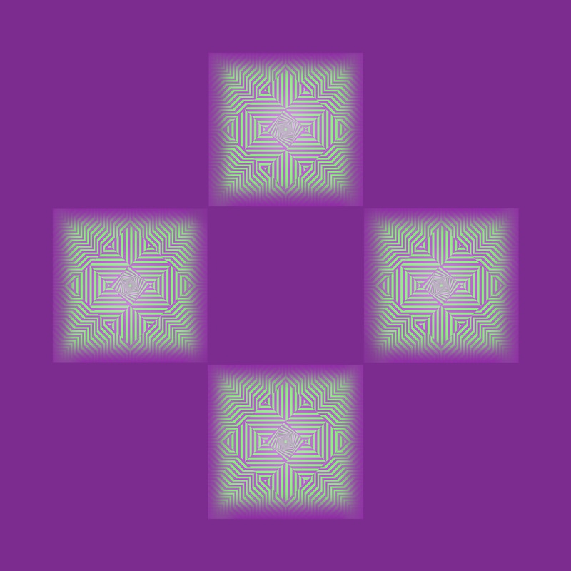
I learned something new about art history while working on this project. I discovered that modern art styles, such as Op Art, have been around much longer than just the 2000's like I had thought. Op Art was thought to have been inspired by an art piece created in the 1930's, which was shocking to me because I didn't imagine such a modern style would date back so far. The tools I used to create a three-dimensional effect in my Op Art shape were the polygonal lasso, magic wand tool, eraser, paint bucket, eyedropper tool, transform tool, paintbrush and gradient. The process I used to do this was copy and paste several Op Art pieces into a Photoshop document, edit them as to erase unnecessary parts and then merge them on top of each other in a way that tricks the eye of the viewer, then change the colors to a complementary color scheme, duplicate it so that there are 4 copies arranged in a cross-like formation, add shadows and highlights to each shape separately and then add a background to the entire image. My Op Art meets the project requirements because I used spacing to create a 3D effect, I used one set of complementary colors, I added shadows and highlights, created a background color and had 4 copies of my shape. I prefer the Op Art hologram project better because I feel like it's more composed and "flowing," in a sense. Something about the Op Art composition seems off to me, and I was unable to alter it in a way that I liked better.
hologram group project
https://docs.google.com/presentation/d/1nPQ1fOkDHFtmitJVUp0OLhdEWkvxvDwcFvsZ7h2aN3I/edit#slide=id.g1cf0334971_0_164
Photoshop File: For the photoshop file, we started by finding the most contrasting and colorful picture of a jellyfish we could, and then we chose that to use for in our hologram viewer. We then put that picture in photoshop, copied it four times, and arranged it in the proper way for a hologram. We then used the burn and dodge tool to add even greater highlights to the glowing jellyfish near the top, and burning/adding shadows to the darker, blue tentacles. The only thing we adjusted along the way was moving our four pictures closer together when we tested our hologram and realized that the hologram didn't fit inside the viewer because they were too far apart.
Viewer: For our viewer, we wanted to change the color in a way that would emphasize the details of our jellyfish. On the jellyfish we noticed that though there was a lot of blue, there were some hints of orange, red and pink. For that reason, we decided to use a red Sharpie to draw out those red shades. We also enlarged our hologram so that our picture would appear clear. Overall, this all worked. We did try to use paint to tint our viewer, however, not enough light was able to get through.
I liked our project because I felt like we accomplished something together as a team, and we typically work alone so it was a nice change of pace too. Our final product for the viewer and the hologram were both impressive in my opinion, making this a very satisfying project.
video hologram
https://docs.google.com/presentation/d/1qx-n_OfWF6AnBq-f24cyq4xEGJAm48saFMCVv9HqFPg/edit#slide=id.g198ec3ce33_0_215
Something new that I learned in Photoshop while working on this project is how to make multiple groups of layers move in sync in a hologram format in a GIF. My project does meet the requirements because I have completely deleted the background from all of the frames, my final design looks 3D when seen through a hologram viewer, all of the video layers are in sync, and the craftsmanship was good. I liked the group hologram project the best because I got to socialize a bit and get to know my classmates better while also still working on a project I am enthusiastic about. I felt less pressure and stress, and I actually had a really fun time while still learning a lot. I also feel like the end product of the group project was the best out of the several hologram projects we did.
Something new that I learned in Photoshop while working on this project is how to make multiple groups of layers move in sync in a hologram format in a GIF. My project does meet the requirements because I have completely deleted the background from all of the frames, my final design looks 3D when seen through a hologram viewer, all of the video layers are in sync, and the craftsmanship was good. I liked the group hologram project the best because I got to socialize a bit and get to know my classmates better while also still working on a project I am enthusiastic about. I felt less pressure and stress, and I actually had a really fun time while still learning a lot. I also feel like the end product of the group project was the best out of the several hologram projects we did.
kara walker
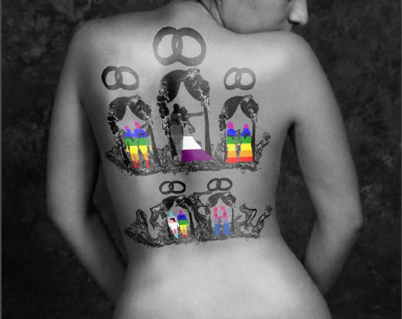
I was inspired to create this project because of recent news stories, such as the Orlando Shooting, and my friends and family who aren't heterosexual and face discrimination daily. I decided to use a person's back as the image I put the silhouette on because it is symbolism to how the weight of the issue is on everyone's backs, and we can't hide it anymore (shown by the back being bare). I used the transform tool, the paint bucket, the eraser, the polygonal lasso, the magic wand, the chrome filter, the burn tool, the dodge tool, paintbrush and clipping mask. I chose to use these tools because they were the ones that I was most comfortable and used to using, and they got the job done without being hard to navigate. This project shows that I have challenged myself in my work because I have never worked on a project that was supposed to show a social/political issue in modern times before. While I have worked on projects where there was a deeper meaning to what I made, such as the Animal Morph or Fireworks Meme project, it typically did not relate to a national/international issue. The most successful aspect of my project is how the silhouettes of each couple turned out with the overlaying of the different pride flag colors. I learned how to transform and edit photos in Photoshop so that they look like they are merged together into one picture by using the transform, dodge, burn and opacity tools.
genius hour summary
I worked on three different projects, my digital drawing in Photoshop Elements, my photo edit and my digital drawing in FireAlpaca. My first project was a digital drawing of a Mexican sugar skull in Photoshop Elements made entirely from the shape tool, but I decided to change my project next week so I never finished it. My second project was a photo edit of the band My Chemical Romance, and I added purple lighting to the photo and added a purple gradient background. My final project was a digital drawing of one of my friends in FireAlpaca that I did freehand and added a cool background too. It was easy to focus and get absorbed into the project during genius hour because since you got to choose what you did, it was always something you enjoyed. Sometimes it was difficult to think of a specific skill, concept or idea to practice for genius hour. In the future I will use the skills, concepts and ideas I learned to help me in more advanced digital art classes in high school and in college, and then later on in my artistic career.
caricature
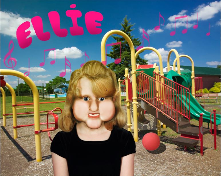
I was inspired to create this after looking through old photos on my computer and finding my little sister's old school photo. I was inspired to use bright colors to represent the joyful and positive times from when my sister was younger, and bubble letters to represent how chubby my sister was back then. I put music notes in the background because my sister loves music. The tools I used the most for this project were the liquefy filter, paint daubs filter, and paintbrush because I am familiar with them and the liquefy filter allowed me to accentuate my sister's physical features easily. I have not used the liquefy filter very much in the past, and I am not very skilled when it comes to editing a realistic photo to look like a caricature. I have had experience with editing realistic photos to have a different appearance, like in the face mask project, but never to make it look like a cartoon. The most successful aspect of my project was fixing the coloring on my sister's lips, because it looked like only one half of her lower lip was colored, so I made it fuller. The least successful aspect of my project was the shadows on the face, because it was a mix of hard and soft shadows. I learned how to use the liquefy filter better by getting lots of practice from this project.
Pop art
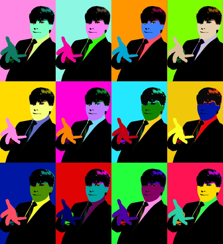
I was inspired by sharp contrasts and color palettes that aren't perfectly paired, and my best friend and pen pal Finn, who is a total nerd, but the sweetest person in the world. I used hue/saturation adjustments, the paint bucket, polygonal lasso, crop tool, color fill effect and selection/move tool. I used these tools because I am familiar with them and they made it easiest to alter the colors of each section of the copies of the picture. This project challenged me in my work because I have not had to make so many duplicates and had to edit all of them individually and uniquely before because in most of my past digital imaging projects, such as the animal morph, face mask, and Charley Harper project, there was only one copy of the image I had to work with. The most successful aspect of my project is the clean separation of each section of the person. The least successful aspect was the color scheme because I began to struggle with finding new color patterns once I got to the sixth copy of my image. I learned how to easily change the color scheme of a photo with hue/saturation adjustments.
abstract expressionism
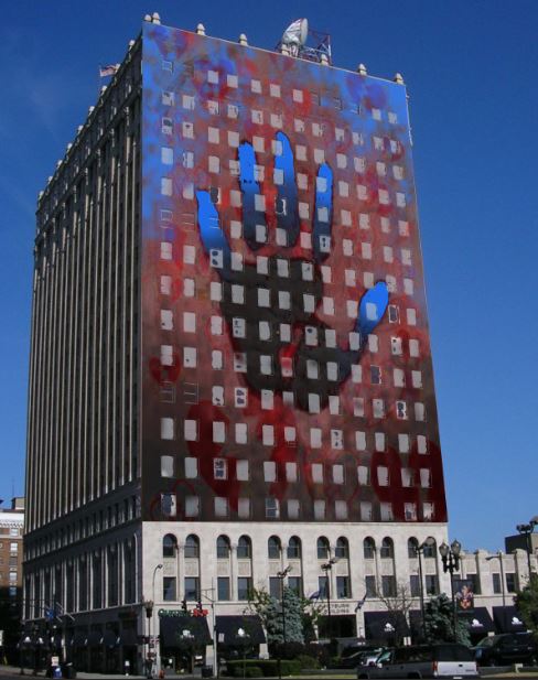
I was inspired to create this piece by the lyrics of the song XO by Fall Out Boy and a phrase from Colors by Halsey, and how much I could relate to the meaning of the song. I used the colors black and red because they are associated with emptiness, loneliness, anger and passion, and the color blue because it counters the negative emotions from black and red with positive emotions of reassurance and hope with the soothing blue accents. I used a hand print as the focal point because your hand print is like your identity, so the colors and their meanings play into that. I used the clipping mask, magic wand, hue and saturation adjustments, paintbrush, eraser and opacity variations to create this project because it allowed me to merge the three abstract images together in a unique and unified way. I have challenged myself in my work because I have never scanned my traditional art to use in a digital program before, since in all of my past digital imaging projects I have started and finished digital, such as my animal morph project where I found images online and edited them digitally, never picking up a pen and paper. The most successful aspect of my project is the portrayal of emotions it gives the viewer. The least successful aspect of my project is how I merged all of the images together, because I feel like some layers were overly stressed and others were not stressed enough. I learned how to scan artwork and transfer it to a digital program while working on this project.
surrealism
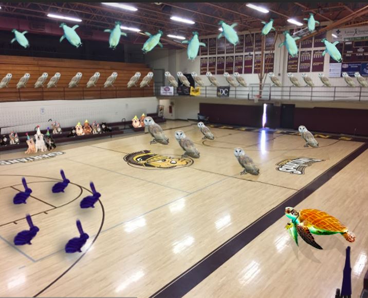
I was inspired to use owls in my project because they are one of my favorite animals, and I find them very majestic and beautiful. I used the magic wand tool, the eraser, the paint bucket and the transform tool to create this. I chose to use these tools because they made it the easiest to erase the background from the image cleanly, and to add a shadow in. This project has challenged me in my work because I do not have a lot of practice adding shadows to animals. In the animal morph project I added 2 shadows to animals, and that alone was hard for me to do, so to add an individual shadow for all 5 owls was difficult for me. The most success aspect of the project was how all of the other teammates' images fit seamlessly together when each person's section was added in. The least successful part of this project is the shadows/highlights because they do not all seem to come from the exact same light source. I did not learn anything new while working on this project.
final class reflection
My favorite project in class this year was the animal morph because I felt like I could really let my creative side show, and I had the opportunity to work with images of my favorite animals. The project was challenging due to it being difficult to seamlessly blend the animal parts together, but it was not so hard that it was discouraging or stressful. I also was able to enter my completed animal morph project into a state art exhibit at the capital, so I was very proud of myself and my work. But my least favorite project in class this year was the Charley Harper project because I struggled a lot with it and fell behind often. I had a hard time transforming the shapes to match the outline of the animal, and an even harder time adding different patterns to each shape. Because I had such a difficult time completing this project, that made it my least favorite.
I believe that the projects in this class were paced well, but it might be even better if we were allowed another day or two on more complicated projects. As for the variety of projects, I was excited to be able to try so many artistic styles in one school year, but I also feel like it was not necessary to have reocurring style themes/skills and that we could have potentionally traded a similar project for a new project on a different style. That was one of the reasons why I enjoyed Genius Hour so much. I was able to try something entirely new that I was interested in, and at my own pace too. The class environment was pleasant and homey, if not a little stuffy at times due to the heat. My teacher Ms. Sand was a very influential figure for me this school year, and helped me a lot. She taught me new skills, showed me new art programs, and also was the person who helped me enter my artwork into the state exhibit. On top of it all, she also was a soft-spoken, kind, passionate teacher who was very down to Earth, and I look forward to being a student of hers for the next three years. My only real complaint about this class was the students who were distracting, loud, and rude to Ms. Sand, the few good students in the class, and me.
I would definitely recommend this class to a friend, especially one who is artistic, because I heartily enjoyed it. I also feel like the skills I learned over the course of the year are beneficial to almost anyone, so that gives all the more reason for a person to take this class. What I learned this year will aid me in my future artistic career, whether it be concept art, graphic design or animation. I plan on taking the advanced level of this class next year.
independent project 1
https://docs.google.com/presentation/d/18pm8JCYb6YHNuBS2XciFA7a2C8-z0nfp7D_9m2LTzr0/edit?usp=sharing
I created a GIF of a fictional character named Daphne that my sister made. It is a simple loop of her looking side-to-side and then smirking. My goal for this project was to practice simple animation, and I am a novice to the field, and begin to work on learning how to make more seamless loops and movements. I used FireAlpaca to create each frame and AlpacaDouga to make it into a GIF (website here: http://firealpaca.com/en/douga). I am not very satisfied with the result of this project, but I am not too harsh on myself over this specific piece because I had to finish it quickly and begin a new project that had a looming deadline, so I could not put much detail and focus into it.
I created a GIF of a fictional character named Daphne that my sister made. It is a simple loop of her looking side-to-side and then smirking. My goal for this project was to practice simple animation, and I am a novice to the field, and begin to work on learning how to make more seamless loops and movements. I used FireAlpaca to create each frame and AlpacaDouga to make it into a GIF (website here: http://firealpaca.com/en/douga). I am not very satisfied with the result of this project, but I am not too harsh on myself over this specific piece because I had to finish it quickly and begin a new project that had a looming deadline, so I could not put much detail and focus into it.
TEXT ART
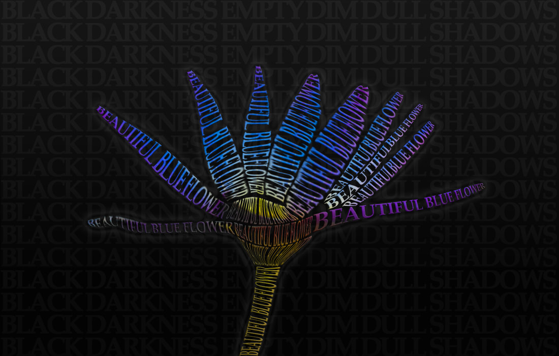
I was inspired to create the subject matter of my project, which is a blue flower made out of the words "Beautiful blue flower" on a black background with the words "Black darkness empty dim dull shadows," because it represents how you can find beauty even in the darkest of times, and the stark contrast between the vivid shades of blue against the black background was appealing to the eye. This project shows that I have challenged myself in my work because I have not worked with the puppet warp before and that was what I used for a majority of the project. The most successful aspect of my project was the result of the warping of the text onto the flower, and the least successful aspect was the background because I believe I could have added more detail to it so it wasn't as bland looking. I learned how to use the puppet warp and how to use the warp tool better in Photoshop by doing this project.
independent project 2
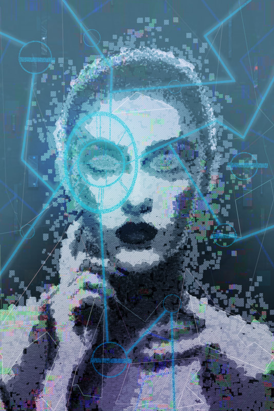
http://www.digitalartsonline.co.uk/tutorials/photoshop/create-glitchy-sci-fi-art-using-photoshop-blending-modes/
For this project I wanted to explore a new technique I have never tried before, and I found a tutorial online for giving a photo a "glitch effect" to make it look more sci-fi. I used the tutorial and Adobe Photoshop to create this piece digitally. My goals for this project were to learn more about Photoshop filters, layer styles and effects and also how to give a glitch/tech effect to a normal picture. I am content with the result of my project, but feel like I followed the tutorial perhaps a bit closer than I should have, as it does not show my own unique touch as much as I would like it to. I feel like the blue light at the top left and the purple light on the bottom were not necessary.
For this project I wanted to explore a new technique I have never tried before, and I found a tutorial online for giving a photo a "glitch effect" to make it look more sci-fi. I used the tutorial and Adobe Photoshop to create this piece digitally. My goals for this project were to learn more about Photoshop filters, layer styles and effects and also how to give a glitch/tech effect to a normal picture. I am content with the result of my project, but feel like I followed the tutorial perhaps a bit closer than I should have, as it does not show my own unique touch as much as I would like it to. I feel like the blue light at the top left and the purple light on the bottom were not necessary.
adult coloring book

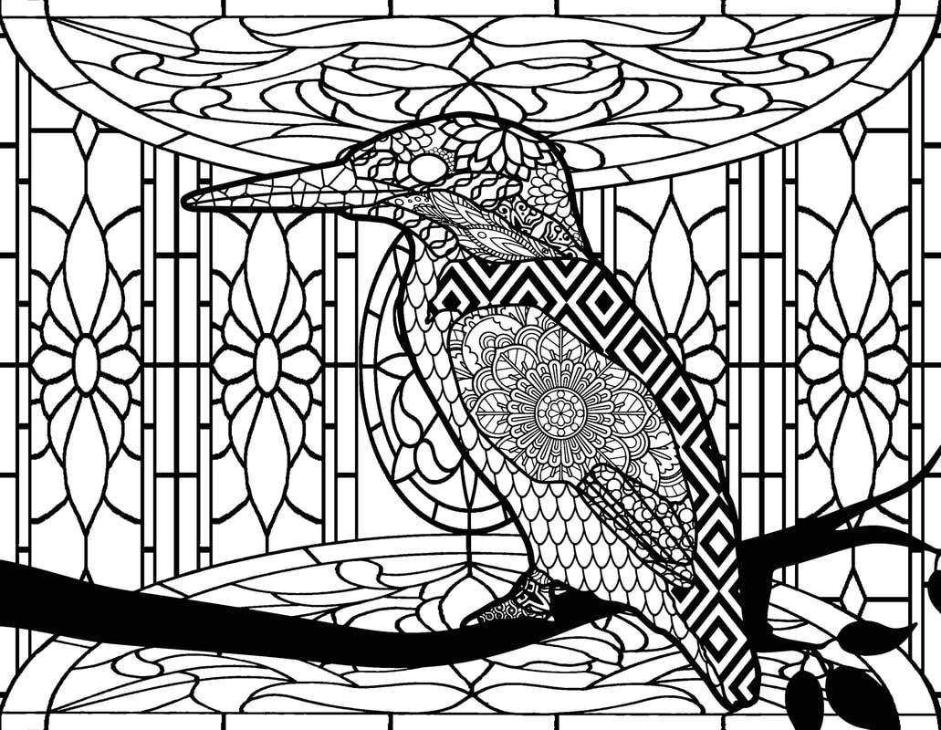
For this project I created a coloring page based off of an image of a hummingbird. My goals for this project were to create a composition that had complexity, but amidst the intricacy to have a very obvious focal point. I used Adobe Photoshop to arrange the patterns and Adobe Illustrator to clean up the lines and add finishing touches. I am quite satisfied with the outcome of this piece, aside from the slightly eye-straining and cluttered patterns on the hummingbird, specifically its head.
independent project 3
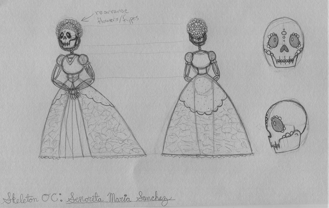
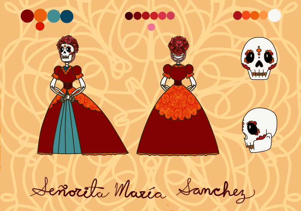
For my project I created a Dia de los Muertos skeleton character reference sheet. I chose to do this project because I want to become a concept artist for a living, so I need to practice creating characters and designs, so I decided to challenge myself with the anatomy of a skeleton and the intricate designs of a sugar skull. I started by sketching out my idea in my sketchbook, then scanning it into FireAlpaca. I then digitally inked and colored it, playing with the color palette and figuring out what fit best with the feeling of the character I wanted. I am very happy with the final result of the character sheet, and I plan on posting it to a character design website. If I decided to return to this piece again, I might work on changing the dress design a bit to make it have a more natural feeling to it.
semester reflection
I always walk into the classroom smiling because Advanced Digital Imaging is my favorite class. I participate every day, working on new and exciting projects, and sharing tips and tricks with my classmates. I have been having a great time and have learned a lot about Adobe Photoshop and Adobe Illustrator thoughout the first semester, and can't wait to continue to discover new techniques and come up with new ideas in the second semester. During the second semester I would like to work with Illustrator more and do more projects pertaining to editing photos in an aesthetic manner and for cleaning them up. I look forward to what is in store for this class throughout the rest of the school year.
Art Theme to explore


One theme that I would like to explore in-depth next semester is ceremony and society. Everyone in the world, in the past, present, and future, has belonged to a unique and intricate society filled with rich culture. From religion to politics to social norms, these aspects of our culture define us as a people. Every society is different, and portrays their individuality in different artistic ways, whether it be fashion, trinkets, paintings, sketches, furniture or religious pieces. Our societal and cultural artwork expresses our beliefs and norms, our well-being and our individuality.
independent project 4
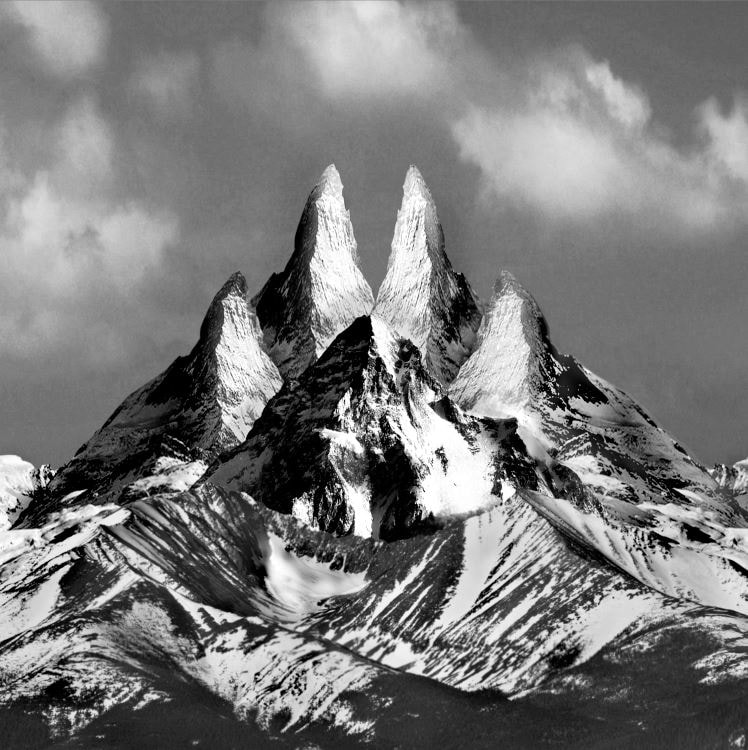
For my 4th independent project, I decided to work on my submission for a local art exhibit that my friend is hosting. The theme is nature, so I found inspiration from my vacations to Gatlinburg and seeing the serene mountains everywhere. I decided to arrange several stock photos of mountains in the shape of a paw print, since I have never seen anything done like that before but I imagined that it would be a very interesting piece. I organized and cropped the images and then turned the file to gray scale mode, and applied finishing touches using the burn tool, dodge tool, paintbrush, and filters such as multiply and color dodge. I am overall very satisfied with this piece because it turned out just like I hoped, which does not happen very often in my work. If I had more time to work on it I would likely apply more finite details and played with the lighting.
multi-panel piece


For my multi-panel project, I decided to focus on the topic of school spirit and gender equality. My school has a very masculine mascot, a Spartan, so I wanted to incorporate some femininity to it. I chose to use maroon and gold because they are my school colors. The man and the woman both hold an olive branch to show that we are peaceful and unified, and a spear to show that we will defend our school and our pride. I used the magic wand and paint bucket tool to create the silhouettes, and used stroke to define the shapes better. I am content with the organization and unity of the piece. I would like to work on editing the stroke on the olive branch in the future because it looks thicker than the other outlines.
Independent project 5
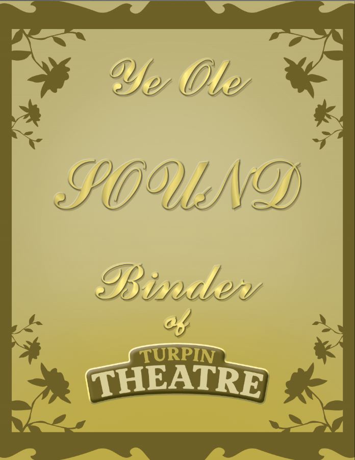
For my 5th independent project, I decided to work on creating binder covers for each crew chief in my theatre group. I took inspiration from old posters, book covers, and literature because I love the font and feeling of old calligraphy. I found a font on Photoshop close enough to what I was looking for, and then applied multiple filters to the text (satin, glow, etc.) to give it a refined edge, and repeated the process with each different crew name. I then created a border using shapes from Photoshop (a flower and a frame). I am content with the result of my work, yet I still feel like something is missing, or possibly that the text doesn't stand out enough. If I had more time to work on it I would play around with changing the color scheme and the border.
rotoscoping
https://docs.google.com/presentation/d/1RTk7pneDSYV5Uniw11jWwZoLMiuPX7wJVIYFbyBIl7g/edit#slide=id.g39dee4bf8b_0_69
For my rotoscoping project, I decided to take a video of a couple doing the waltz and animate it so that it resembled a moving oil painting. I took inspiration from the movie Loving Vincent because I was fascinated by the detailed artwork and beauty shown in the film, and I also took inspiration from the rough charm of oil paintings. I experimented with multiple filters in the filter gallery in Photoshop, and after finding the perfect combination of several of them, I copied and pasted the layer style to each individual frame of the video. There was a total of approximately 270 frames. I then went back into frames that the filters did not neatly apply to, since they had left some oddly colored patches, and used the stamp tool and paintbrush to fix them as best as I could. After having spent several days simply trying to fix the filter mishaps, I decided that I needed to move on to my next project to make sure I didn't fall behind in class, so I left the remainder of the film unedited (aside from the filters that were already applied). I am not very happy with the result of the rotoscoping project because the frames where the filters did not apply correctly look choppy and messy, and even worse because the frames prior to them that I tried to fix were not cohesive in their editing. If I decided to come back to this project, I would want to try to finish fixing the unusual frames and then go back and make sure that the edited frames flowed together smoothly.
Gel Medium Transfer
For my gel medium transfer project, I created a mixed media piece about the struggles of determining the rights and wrongs of justice. I took inspiration from old Greek statues and the scales of justice, and the idea of the conflict between mind and emotion. I printed out several photos and used the gel medium transfer method to apply them to a board of wood. On one side I applied a sky background that I had cut into two jagged parts (to represent the uneven split between mind and emotion), and then added the photos of Athena (the goddess of wisdom, representing logical thinking) and Hebe (the Greek goddess of youth, representing the innocent heart). I then used Washi tape to add a frame to this side of the wood. On the other side, I added a picture of a statue of the scales of justice, letting some of the parts of the paper pull off messily (to represent the damage and old age of the justice system), and then used markers to draw a brain and a heart on either side of the scale. I also drew a large colorful thought bubble coming out of the head of Lady Justice with a dark, faded heart in the center, showing the irony of thinking (mind) about the heart (emotion), the two opposites mixing together unintentionally. I am fairly content with the result of my work because I am proud of the deep thought and symbolism that I used to portray the deeper meaning behind the piece, but I feel like the technique I used to apply the medium was not very successful and does not appear to be very cleanly done. If I had more time to work on it I would either add more photos or draw some basic images on it, or potentially even redo the entire piece in order to try to use a different method of application in hopes of having a cleaner transfer.
cameo cutting project

For my cameo cutting project, I decided to print line art of Malachite from the show Steven Universe, a cartoon that I watch with my younger sister. I took inspiration from this show because its smooth flow of the plot portrays complex relationships and deep thoughts, but is still forward-thinking and lighthearted. I created this piece by using the paint bucket tool and stroke blending mode in Photoshop to make line art from a screen cap of the character. I am fairly content with the final result of my work because I love the aesthetic of paper cut-outs, but the mouth of Malachite ripped when going through the cameo cutter, so I had to remove it from the final piece. If I decided to recreate this project, I would probably go into Photoshop to change the line art of the mouth and re-cut the image in hopes of it not ripping.
Independent project 6
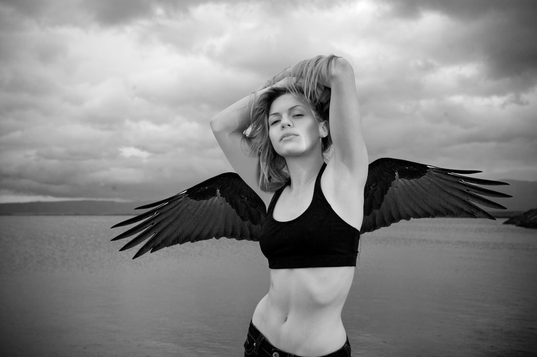
For my 6th independent project, I took a photo of a model near a lake and gave her wings. I took inspiration from the idea of wings symbolizing freedom and the new popularity of them in modern culture. After finding the photo of the model, I then looked for a pair of wings I could use. I removed the background from the wings and changed the settings to Grayscale, turning the entire file black and white. I carefully rotated the wings in hopes of trying to get them evenly placed with the tilt of the model's body, and erased the parts of them that would not be visible behind her. After finding a satisfying balance between the wings and the model, I changed the levels and curves of the wings to make them darker in order to stand out more in the image. I am happy with the finished piece for the most part, because while I feel like it has good balance and contrast, the anatomy between the wings and the model is still incorrect after all of the time I had put into trying to place them accurately. If I had more time to work on it I would try to fix the anatomy, and perhaps add birds to the sky in the background.
Final class reflection
My favorite project I did this year was my second independent project where I followed a glitch effect Photoshop tutorial. It is my favorite piece I have created this year and has had some of the best overall feedback out of my entire portfolio, and I feel like it is well-polished. I am proud of all of the effort I put into it, especially with the intimidation of how much detail was needed to be put into it. My least favorite project this year was my first independent project where I made a short GIF animation of a character that my sister created. I was rushed on it due to a new project that had a deadline that I needed to start on right away, so I didn't add enough detail to each frame and did not create enough frames for a smooth animation.
I enjoyed the pace and the creative freedom that was given in class, and the friendly and supportive bond between the students and the teacher in this year's Advanced Digital Imaging class. Each project had a recommended period of time to complete it in, but it was easy to work around finishing either early or late. There was a lot of freedom with projects, both class assigned and independent, which I liked because I was able to try new techniques that interested me and perfect skills that I already had. With class assigned projects, there was still a lot of freedom for students. For example, we still had a lot of choice in the multi-panel project where we could create anything we wanted as long as we had at least 3 panels, it was matted, and had some sort of unity. Since the class was fairly small, consisting of only a little more than a dozen students, the friendships formed were much stronger than possible in our Intro to Digital Imaging class that was much larger last year. I feel at home in our classroom, and have had a great time making new friends and strengthening bonds with old ones.
I would definitely recommend this class to a friend because of the creative freedom it allows and the supportive environment of a smaller group of students. It is also a lot more fun because all of the students who just want to get their art credit out of the way by taking Intro are gone, so you only work with students who are actually passionate about Digital Imaging. I am going to take Advanced Digital Imaging 3 next year in order to continue my work and keep on learning new art skills. The year after that, I plan to take both Advanced Digital Imaging 4 and AP 2D Design in order to prepare myself for going to an art college after I graduate.
